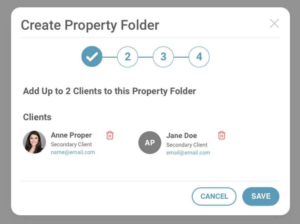
A modal window is a secondary window that opens inside the main window. Users have to interact with it before they can return to the main window. So how do you know when to use it and when not to? Here are some general guides to help you decide.
- Modal dialogs can make sense when they help keep the flow (i.e. you don’t have to leave the page you’re on).
- Don’t use modal dialogs for things that should be linkable or searchable (as the URL doesn’t change, it can’t be linked externally and that includes search engines).
- Use modal windows to provide simplicity to long pages. Make tasks seem easy for the user.
- Sometimes more complex info can make usability easier in a modal window. For instance such sharing info by email, rss, social see example below.
Here is a list of content that tends to work well in modal windows:
- Sign up / log in forms
- Contact forms
- Social shares
- Tool tips
- Alerts
- Calendars
- Free trials or demos usually with a sign up form
- Directions or steps
- Ecommerce product more info
- View images at a larger scale


